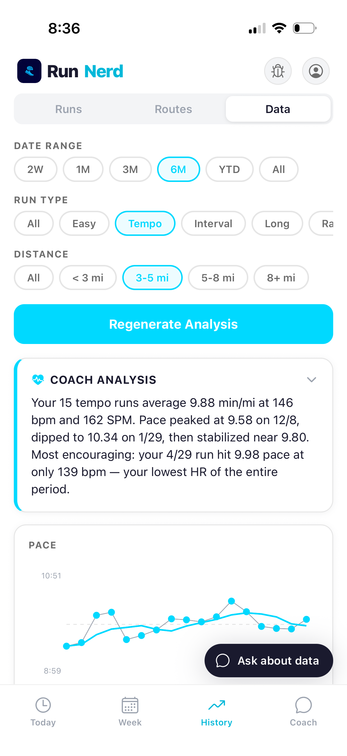
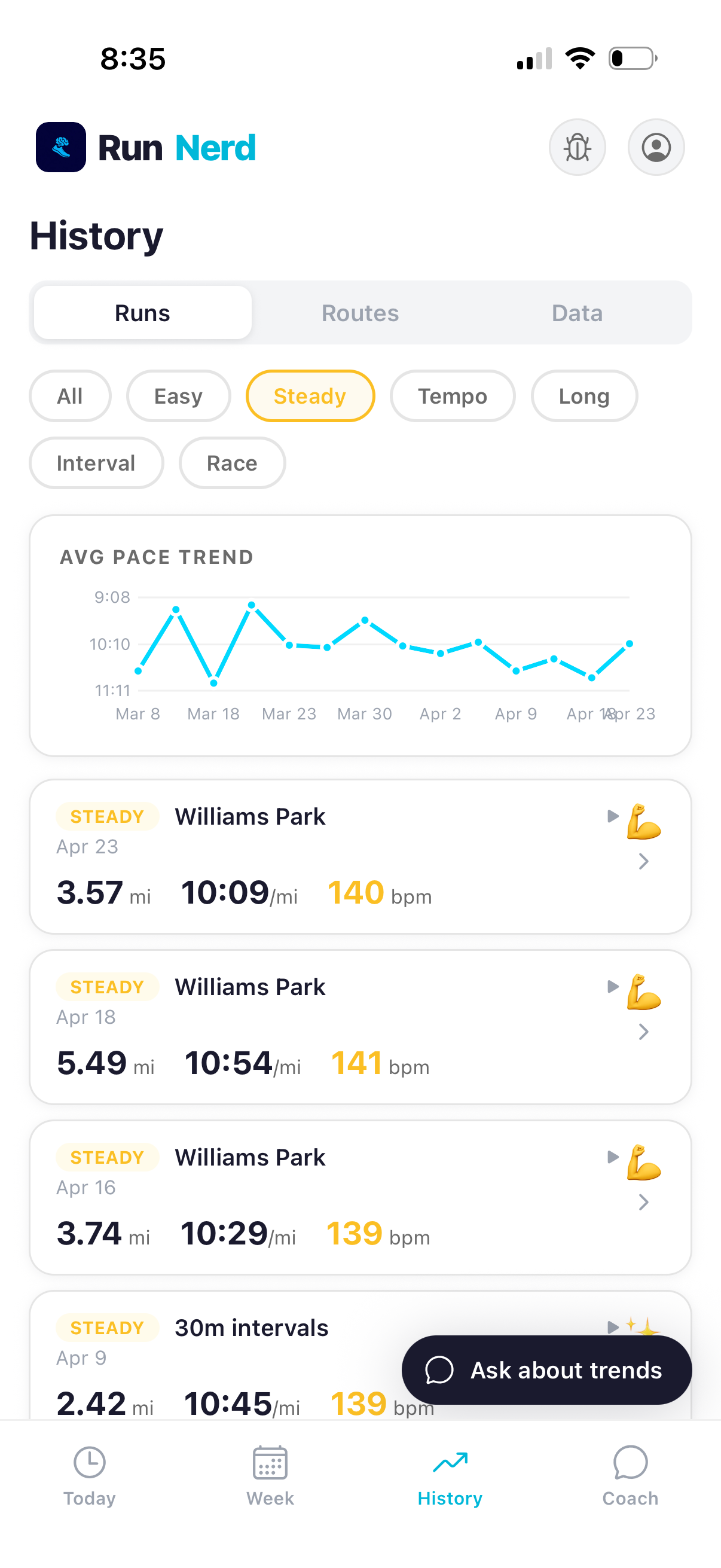
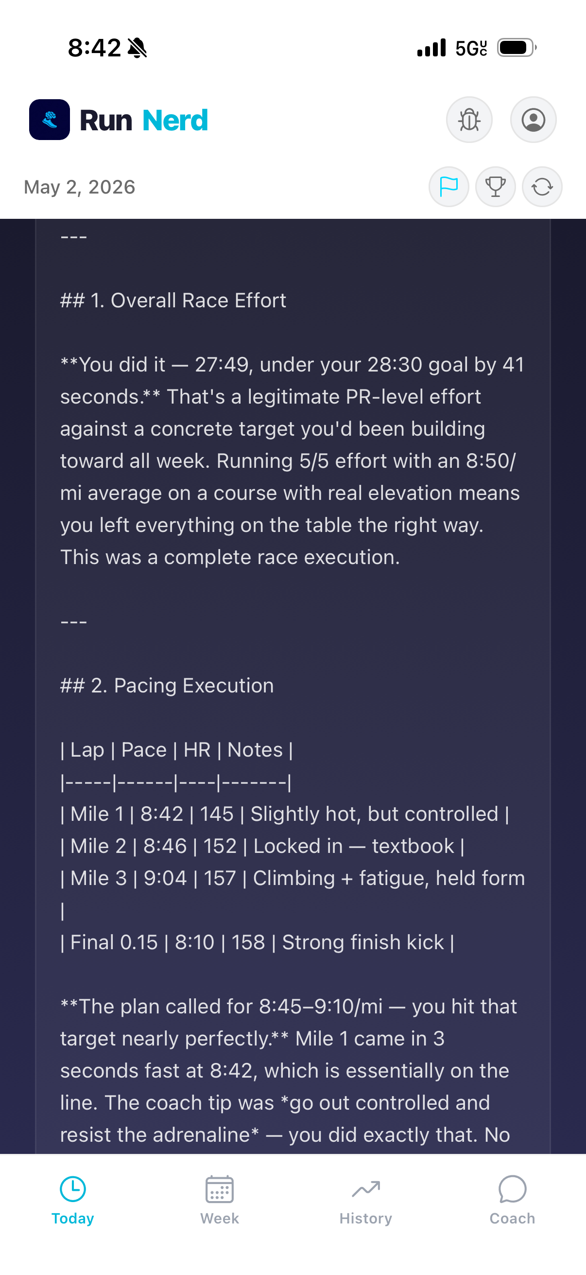
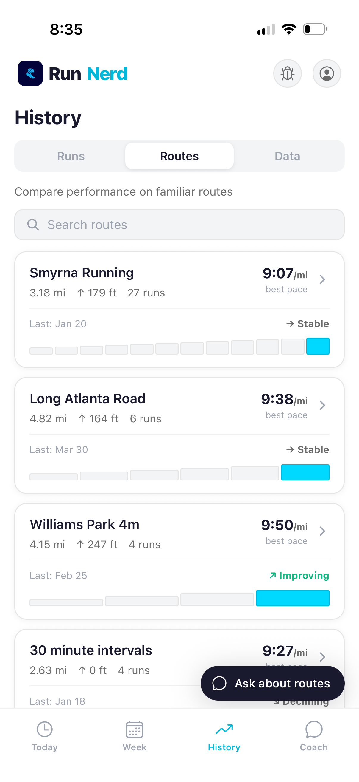
Same pace, lower heart rate. Easy days that were actually easy. Routes you run more than you realized. RunNerd reads across every run you've logged and surfaces what the data says together.
Easy. Tempo. Long. Interval. Race. RunNerd classifies every run automatically based on what your data shows — not what you labeled it before you ran.
Useful when "easy day" runs creep into tempo territory. The classifier doesn't lie to you.
Most runners spend more time in moderate zones than they think. RunNerd tracks where every minute of every run actually lived — Z1 through Z5 — and shows the pattern across weeks.
The 80/20 split shows up here. So does the answer to "why am I tired all the time?"
RunNerd ranks the routes you run by frequency, distance, and pace — Coffee Shop Hop, Pond to Park, Dobbins 5m, the regulars. Patterns emerge: which routes are getting faster, which are easy days in disguise, which you've quietly stopped running.
Your training has a geography. The app reads it.
RunNerd reads from Apple Health today, which means cadence, elevation, and split data come through at HealthKit's resolution. Direct Garmin integration ships post-Beta — the deeper data deserves a deeper pipe. If you're a Garmin user wanting full-resolution analytics, you'll want both.